

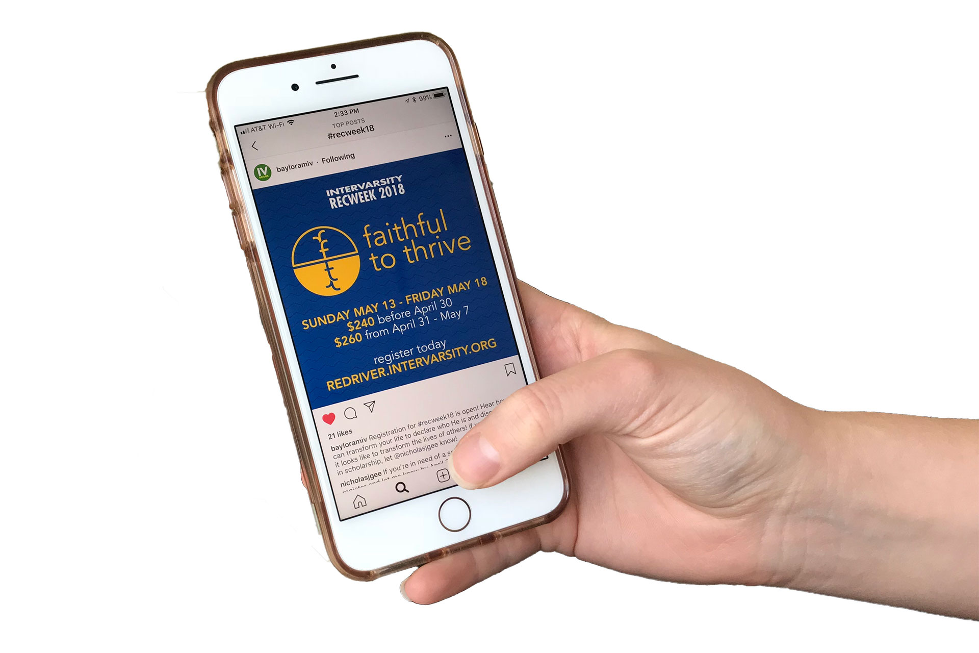
faithful to thrive
Each year, the Red River Region hosts a conference for 500 students from Texas, Oklahoma and Arkansas. The conference is called “Recweek” but each year there is also a theme. Recweek’s theme acts as the main brand identity and all marketing materials for the conference are based around the theme. The 2018 theme was “Faithful to Thrive,” inspired by a passage from the Bible that draws metaphors about life from plant imagery.
After some sketching, I realized that lowercase sans-serif "f" and "t" are very similar shapes, and almost perfectly mirrored. The “f” in faithful and the “t” in thrive could be drawn in such a way that they resembled a plant and it’s roots. It took many iterations to get this right, but I am satisfied with the solution.
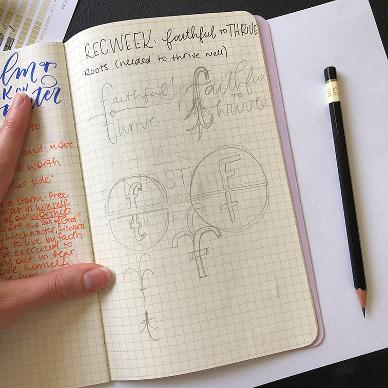
Initial sketches, playing with the lowercase "f" and "t"

Round one ideas

Round two ideas

After solving the icon and logo solution, I designed marketing materials. The conference is advertised in person through local chapters, and students want to be able to share the conference with their friends on social media. I designed powerpoint slides, Instagram posts, and Facebook cover photos.

PowerPoint slide for use in announcements at local chapters.

Finally, there were a few on-site needs including background slides and participant name tags.
Bonus: one school used the logo to create a photobooth backdrop for all of camp to use.

Background slide for presentations on-site

We were very excited about the photobooth.

One name tag of about 550 that were printed.